
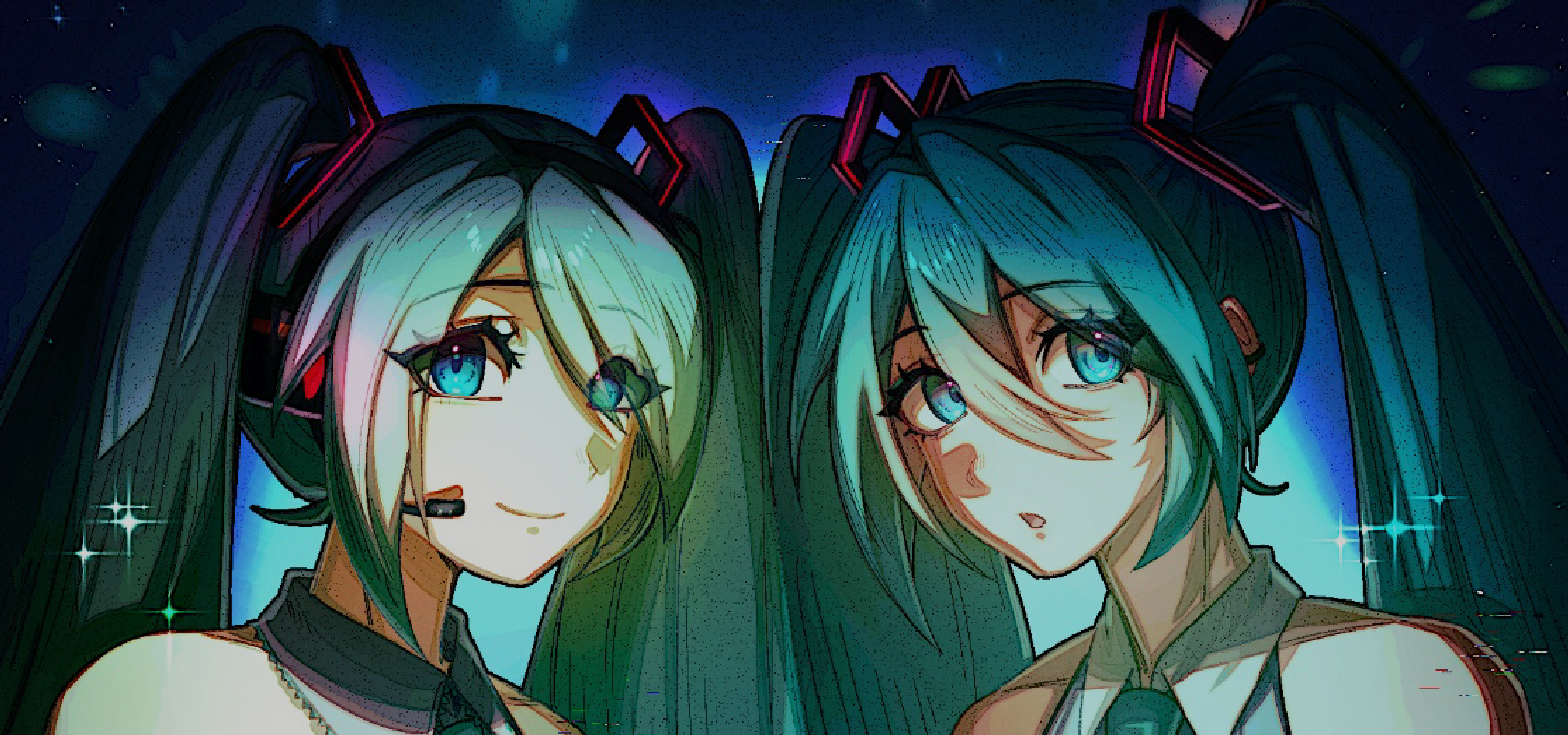
Have You Seen This Girl?: The Symbol of Hatsune Miku
Hatsune Miku is everywhere, and she is hard to miss. Even if the name is unfamiliar to you, you have probably seen her iconic teal pigtails—or, perhaps, you have heard of Vocaloid, the software from which the diva originates. Vocaloid is a voicebank software published by the Japanese company Crypton. Voicebanks are a collection of pre-recorded sounds that users can then “train” into saying whatever they desire, enabling music producers to give voice to their songs without hiring a vocalist. Crypton offers over 100 voicebanks (Vocaloids), each marketed with the image and name of an anime-style character. Yet, outside of the Vocaloid sphere, the internet rarely sees even Miku’s more popular colleagues like Kagamine Rin and Len. So, what makes her the breakout diva?
To start, Miku’s immense popularity could be attributed to her status as Vocaloid’s official mascot, and thus the amount of exposure she naturally receives. Second, her relatively neutral voice and concept makes her flexible and easier to work with; compared to other more niche Vocaloids, like Kaai Yuki, all that is officially known about Miku is that she is a 16-year-old “android diva.” Most Vocaloid producers prefer to work within the given concepts of each Vocaloid, therefore making Miku the most appealing due to her “blank slate” state. However, what truly made Miku the icon she is today is how that neutrality in her voice extends into her design.
Miku does not have a mundane design. On the contrary, it is eye-catching, her signature hair colour and style as well as the neon pink 01 tattoo instantly recognisable. It is these unique details that make her design so adaptable to different costumes and yet so identifiable: as long as just one of these features is maintained, she is recognisable. Consider more concept-heavy Vocaloids like Rin and Len, whose identities are dependent on their original silhouette that it works against their versatility. On the flip side, Megurine Luka, a Vocaloid whose only defining characteristic is her long, loose pink hair, becomes indistinguishable from the next pink-haired anime character once she is given a major hairstyle or outfit change.
Thus, Miku became the perfect mirror for internet users to reflect themselves upon, casting her in every role they could imagine: a schoolgirl, a stuck-up princess, a racer, transcending race and even species. We could view Miku as indicative of changing trends and the internet’s collective wishes.
Miku’s official design has changed with every iteration of the Vocaloid software, with 2007’s V2 Miku being the first, and 2026’s V6 being the latest to join the fray. Notably, although V3 and V4 Miku—which have thinner pigtails and a sleek, modern outfit—have been the official image of Miku for 13 years, V2 Miku has continued to receive just as much love and fanfare throughout their reign. If anything, she is the dominating image.
When V6 Miku’s design was revealed, the fandom rejoiced at the clear return to the classics with the gray vest and plumage of teal hair. Interestingly, it was not only older fans who had experienced V2 Miku for themselves that cheered, but also new fans. Where does this new nostalgia stem from, and why is the fandom, famous for running wild with thousands of its own variations of Miku, still so obsessed with the “original Miku?”
This “newgen” nostalgia for V2 Miku is derived from the growing consumer dissatisfaction with modern brand-making trends. With many of Vocaloid’s most well-known songs having been produced during the V2 era, new fans are obliged to become acquainted with this older Miku despite never experiencing her themselves. Often described as the “golden age”, it shows their dissatisfaction with the current fandom and fondness of the V2 days by proxy.
This fondness is pushed further by how the V3 and V4 Miku lost the whimsical charm of V2 Miku that popularised her—in an attempt to conform to the rest of the industry. Known as debranding, this design trend has swept through nearly every brand, where logos and slogans that once made the brand feel personal are simplified to appeal to a broader audience. Consumers have been fighting against debranding ever since its spread, criticising how “corporate” and “clean” the world seems now. Therefore, the revival of V2 Miku in her V6 design can be seen as a “win” for the consumer: to have one’s wants recognised by the system feels as if real change is happening.
Miku proves an interesting case study of today’s consumer landscape for both brands and consumers themselves. She is shaped almost entirely by her consumers; in watching how Miku evolves online, we can identify which direction not only the Vocaloid fandom but the greater consumer community wants merchandising and designs in brands to move. The consumer, however, must remain vigilant. Although V6 Miku may feel like we are being heard, is that truly the case, or is it another case of nostalgiabaiting to promote Crypton’s image as a consumer-friendly corporation? What are we telling corporations by putting so much emphasis on Miku’s official design instead of the leagues of fan designs that were once, too, popular?